Before you send your artwork or logos into your printer, go over the list below and take care of the 5 main problems we encounter with customer artwork. Not only will we love you for it, but it will make the whole process go easier and faster for you. Here are a few things to look out for and some helpful hints on how to get them.
1) DOUBLE CHECK YOUR BLACK – The Black in your Color Swatch menu should have a CMYK breakdown of 100% Black (0, 0, 0, 100).
Why is this important? When you add cyan, magenta or yellow such as (68, 69, 78, 89) this combination can look “muddy” on press and we want to give you a nice clean black.
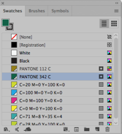
2) USE PANTONE OR CMYK (NOT BOTH) – We print in both, so please double check whether your job is in Pantone or CMYK and keep the colors in your file matching that.
Stating the Obvious We understand it may seem obvious Pantone (or PMS) for a Pantone job and CMYK for a CMYK job, but often when an outside piece of artwork is brought into Illustrator a PMS color can get added into your CMYK file (or vice versa).
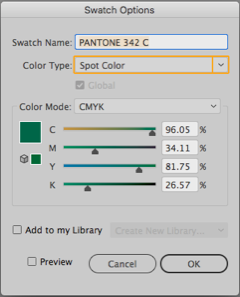
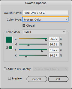
What to do? In Illustrator, double click on the color swatch. A window will appear and under “Color Type” hit the arrow and scroll down to “Process” then click “OK”. Another great resource is to go to the Pantone website to see their CMYK breakdown of your color at https://www.pantone.com/color-finder
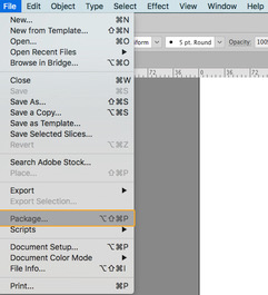
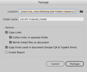
3) PACKAGE YOUR ARTWORK – In Illustrator, go to the menu bar at the top, choose “File” then scroll down to “Package”. The great thing about this feature is that it will grab all your fonts and images used so we will have everything we need to do your job. (Please do not embed your images.)
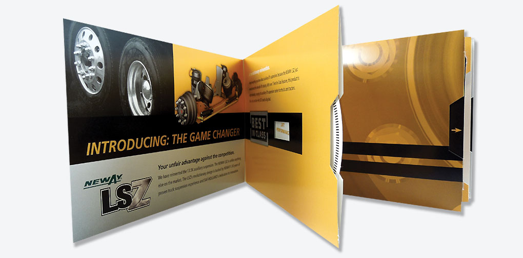
4) USE HIGH RESOLUTION IMAGES – This means we are looking for a CMYK or grayscale image that has at least 300 dpi and is the size (or larger) of the image as it appears on your piece.
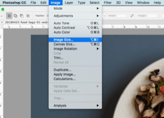
Avoid Fuzzy Images To double check your image size, open your image in Photoshop. Go to the menu bar at the top and choose “Image”. Scroll down to “Image Size” and click. This will tell you the size and dpi of your image.
5) KEEP YOUR TEMPLATE FILES IN ILLUSTRATOR – Adobe InDesign & Photoshop are great programs but they don’t have the tools we need to do your project. Photoshop can flatten colors and make type fuzzy while InDesign effects such as shading and transparencies can disappear when we bring your file back into Illustrator. So the best thing to do is – keep your files in Illustrator.
ASK US QUESTIONS – If you are unsure about a design, want to move a window or die line, or consult about colors and design elements. We are here to help! We want your piece to look amazing and are happy to answer any questions you may have.
► CALL US TODAY AT 1-800-323-4433 ► FREE DESIGN - GET STARTED!


© Copyright 2024 American Slide Chart/Perrygraf.
All rights reserved. Privacy Policy & User Accessibility Statement.
Design & Development J Rudny, LLC